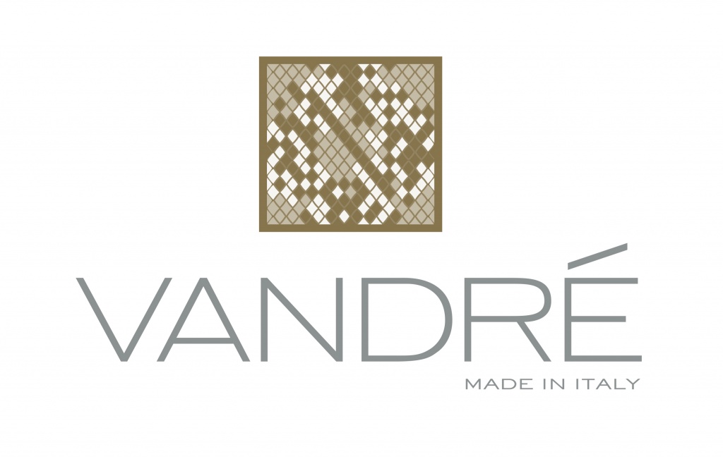
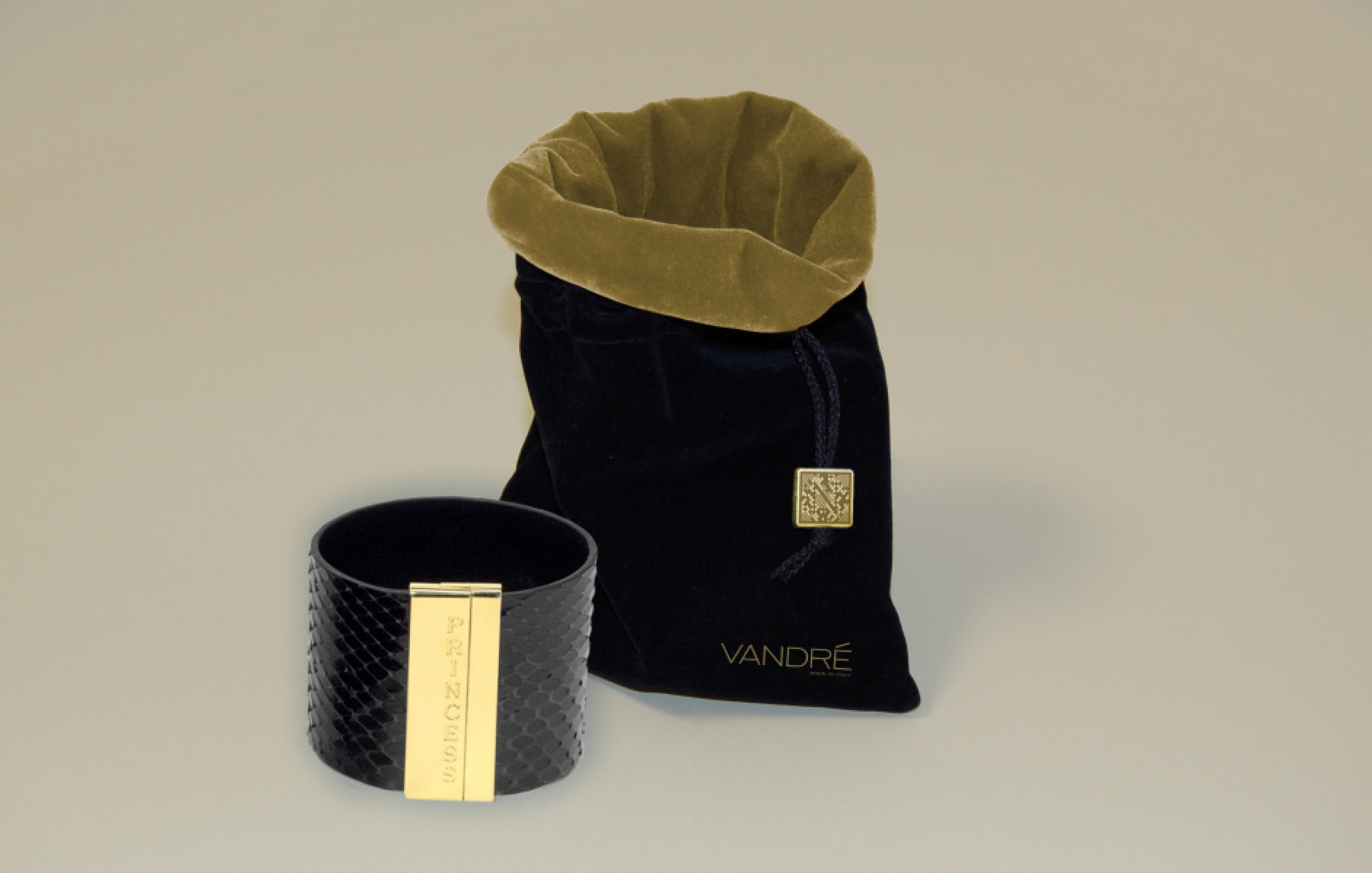
Top Logo – This logo utilises the ‘Python skin’ look, linking to the product being sold, which are premium snake skin fashion products, such as belts, cuffs and bespoke tops. The idea is to give an upper class feeling and richness to the logo and the brand. In this case the new potential owner wanted the emphasis on the N as opposed to the V due their own name, so this is how we created the first stage of the concept.
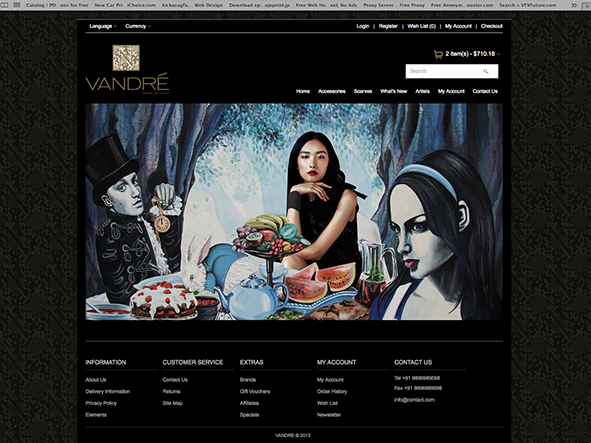
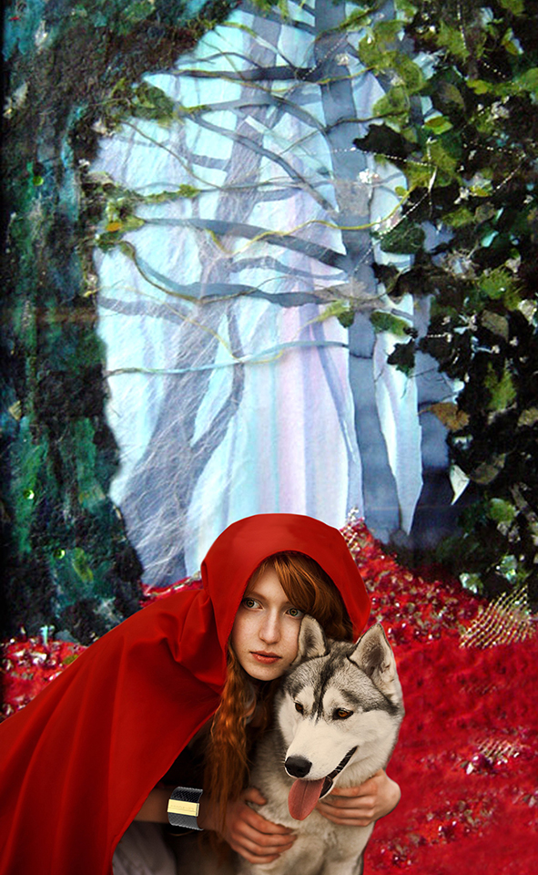
The website also uses the ‘Python skin’ design as a feature along the edges of the site. The Images created here show
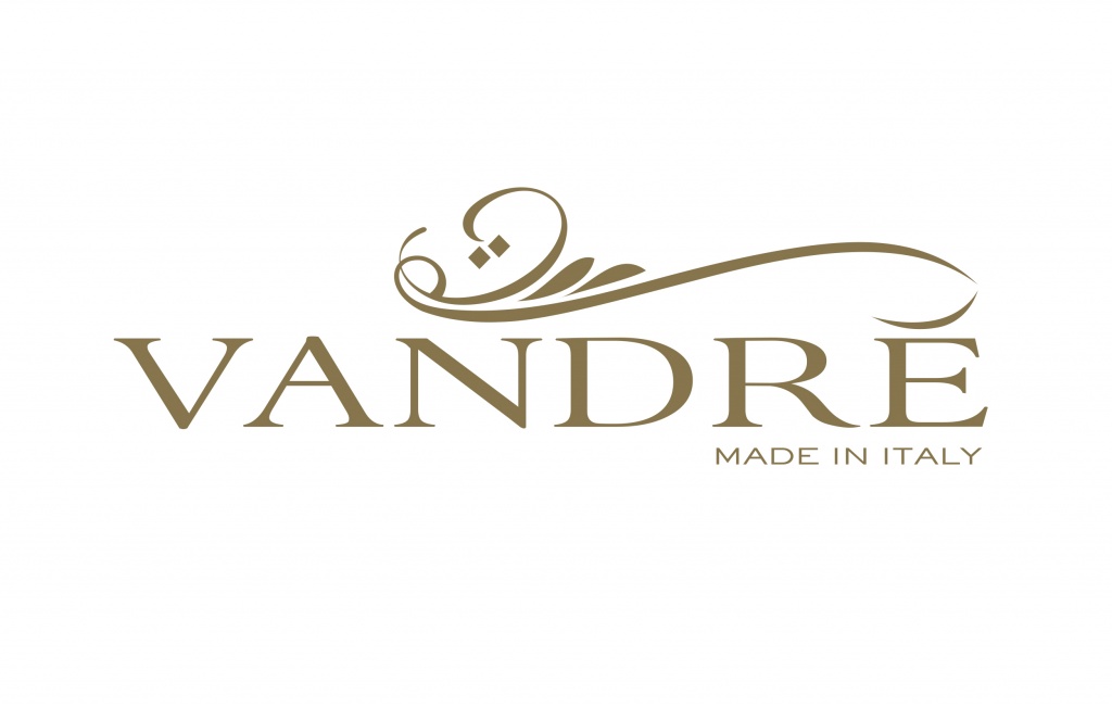
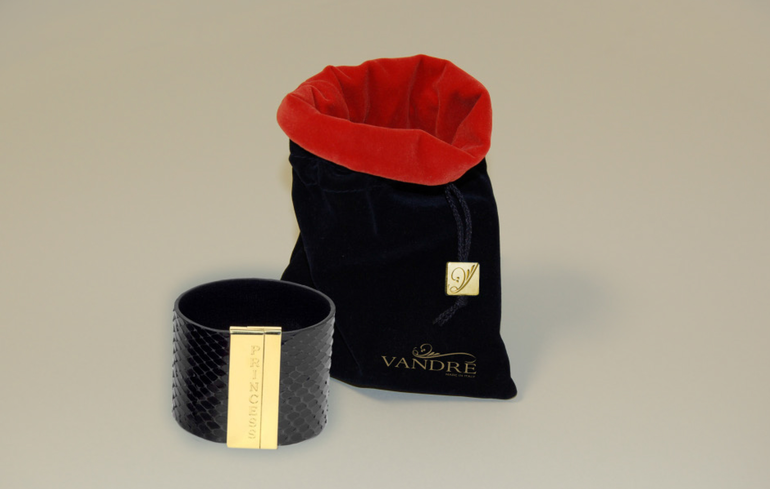
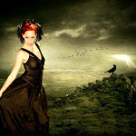
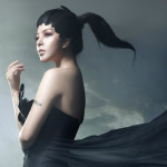
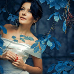
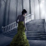
Bottom Logo – This logo idea derives from a mixture of Italian and Arabic designs. To give emphasis to the N the main swoop of the ornamental design starts at that point and continues to form part of the accent on the E. The style of the logo impresses a fantasy feel which fits very well with the imagery used on the website and was a feel that the client wanted to put across.
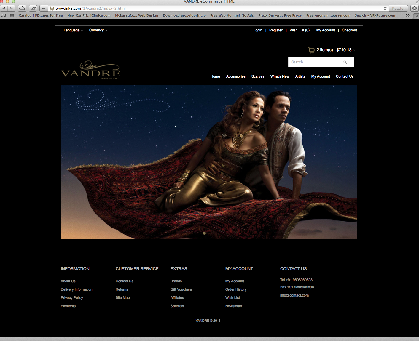
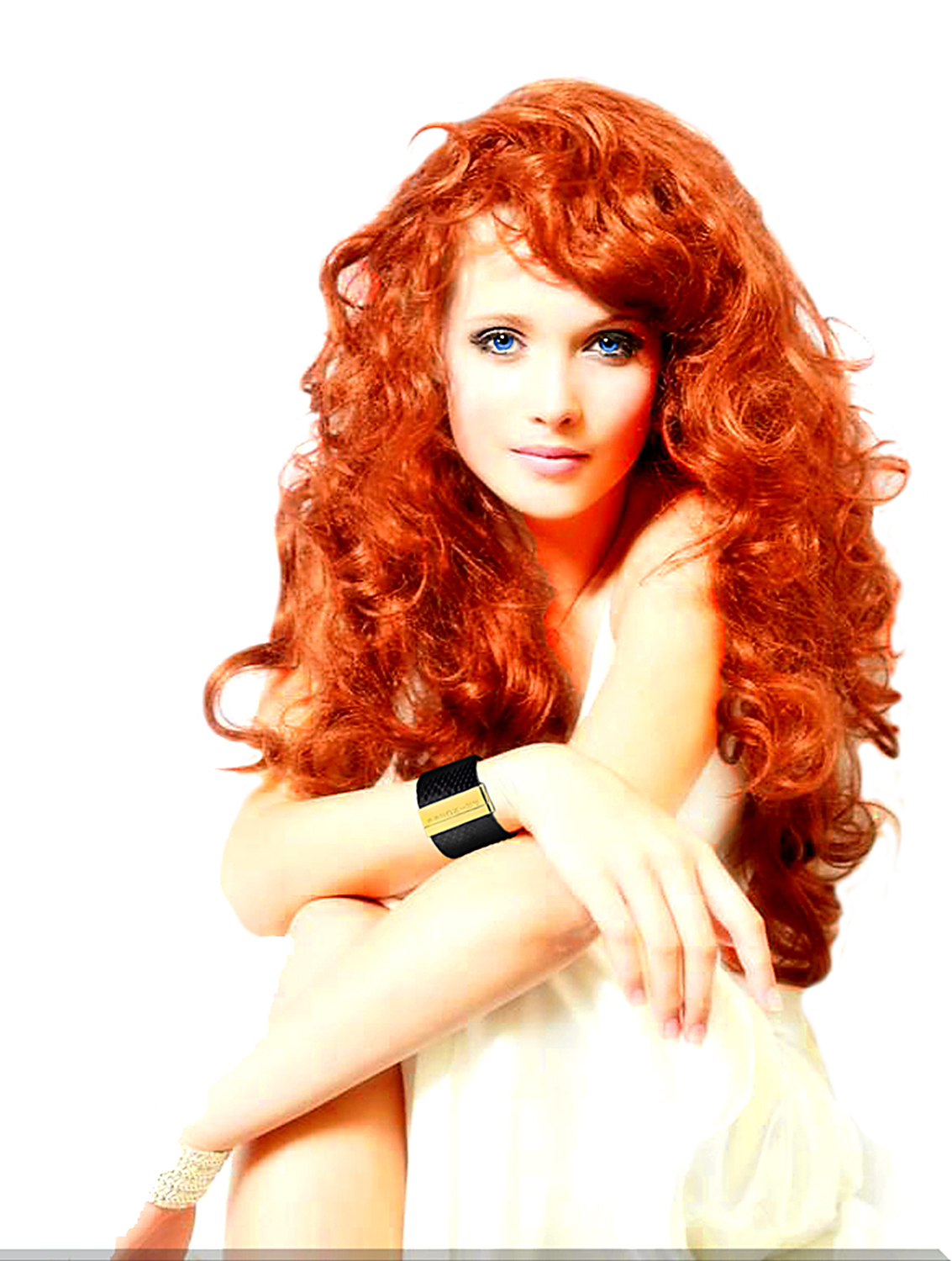
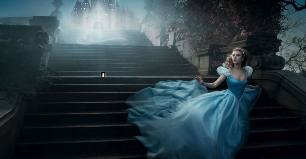
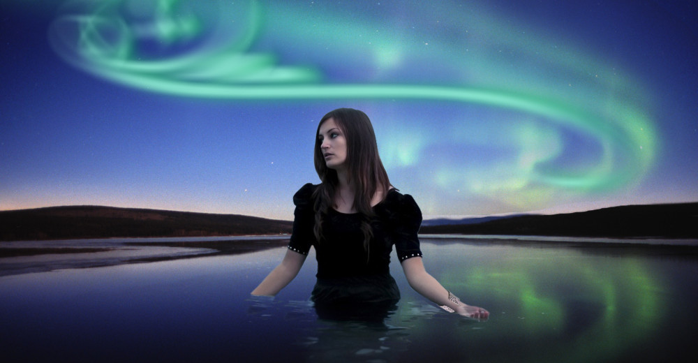
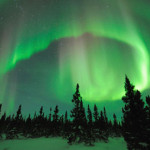
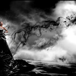
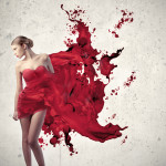
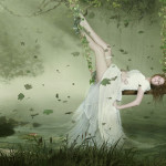
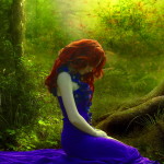
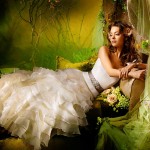
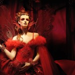
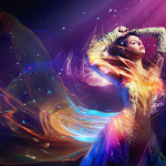
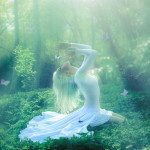
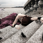
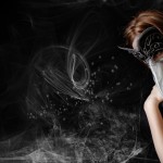
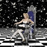
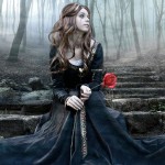
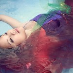
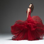
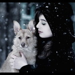
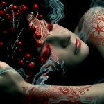
Taking the essence of the Arabic/Italian style logo, the images again have a fantasy feel but entirely photographic. The idea is to use the swoop of the ornamental feature in the images backgrounds to create stars, northern lights and shafts of light to give it that extra special feel as well as enhancing the logo. This would also work well on billboards as people would become more aware of the logo mark.