Bahrain Airport
Best service in the GCC
Doha Wireless Co.
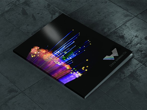
Top Logo – The concept behind this logo idea is based upon the microwave network infrastructure. It creates a feeling of the towers and the dishes used within a W shape. To enhance this further a W has been created within the network structure in Magenta. The magenta/maroon colour is linked to the Qatari flag colour, where the company is based. Furthermore this network system can be enhanced graphically by incorporating a star system background, linking to the fact that the network infrastructure emits out into the ether.
Middle Logo – The following logo idea derives from the waves created and how it connects everything together precisely still using the W shape. To enhance the effect of how these waves move it is possible to use holographic foils when printing to give a feeling of rainbow movement across the shape.
Bottom Logo – The idea behind this logo is to use more fluid shapes to create the W as wireless waves can vary going from point to point. Here it is simplified and very corporate.
IPS
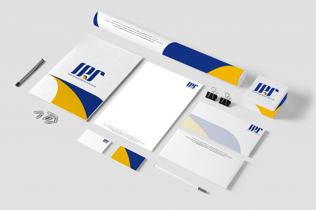
Left Logo – The concept behind this logo idea is based upon the VISA. It creates a feeling of trust and reliability. To enhance this further a the blue colore merge with the yellow that create leaf shape that represent nature. The Blue/Yellow colour is linked to the Visa colours, where it makes the company more familiar. Furthermore this logo can be enhanced graphically by incorporating a conaction system background, linking to the fact that tahe network infrastructure emits out into the ether.
Right Logo – The concept behind this logo idea is based upon the VISA. It creates a feeling of trust and reliability. To enhance this further a the blue colore merge with the Green that create leaf shape that represent nature. The Blue/Green colour is linked to the Visa colours, where it makes the company more familiar. Furthermore this logo can be enhanced graphically by incorporating a conaction system background, linking to the fact that tahe network infrastructure emits out into the ether.
Organika

Organika Foods is one of Bahrain’s leading foodservice distributors. They wanted us to create a new image for their store to increase sales and distribution (Re-branding). Firstly a new logo was created and then a whole new concept was implemented based on their philosophy of providing only organic and environmental friendly products. The colours and the concept are based on mother nature, using leaf, wood and granite stone.
Vandré
Top Logo – This logo utilises the ‘Python skin’ look, linking to the product being sold, which are premium snake skin fashion products, such as belts, cuffs and bespoke tops. The idea is to give an upper class feeling and richness to the logo and the brand. In this case the new potential owner wanted the emphasis on the N as opposed to the V due their own name, so this is how we created the first stage of the concept.
The website also uses the ‘Python skin’ design as a feature along the edges of the site. The Images created here show models wearing the jewellery but placed in a fantasy world depicting ‘Little Red Riding Hood’ and ‘Alice in Wonderland’ The backgrounds have been created using paintings and textiles, created by Jayne Evans © http://www.jayneevansart.co.uk to give the whole look a completely different dimension with an artistic flair.
Bottom Logo – This logo idea derives from a mixture of Italian and Arabic designs. To give emphasis to the N the main swoop of the ornamental design starts at that point and continues to form part of the accent on the E. The style of the logo impresses a fantasy feel which fits very well with the imagery used on the website and was a feel that the client wanted to put across.
Taking the essence of the Arabic/Italian style logo, the images again have a fantasy feel but entirely photographic. The idea is to use the swoop of the ornamental feature in the images backgrounds to create stars, northern lights and shafts of light to give it that extra special feel as well as enhancing the logo. This would also work well on billboards as people would become more aware of the logo mark.
Al Ghanah Group
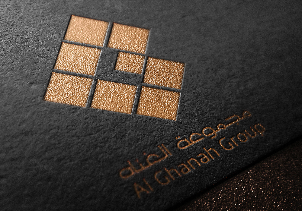
The above logo was created for Al Ghanah Group. They are an umbrella organisation with 8 subsidiary companies underneath them.
Taking this into consideration we created a mark for them which contains 8 blocks representing these companies arranged to look like the letter G.