Naizak
Naizak specialises in advanced wireless system integration solutions, network infrastructure and modern surveillance technology. Delivering reliability and service quality to end users.
As Naizak is a new company, we are in the process of working with them to create their whole brand identity.
Ghassan Car Center
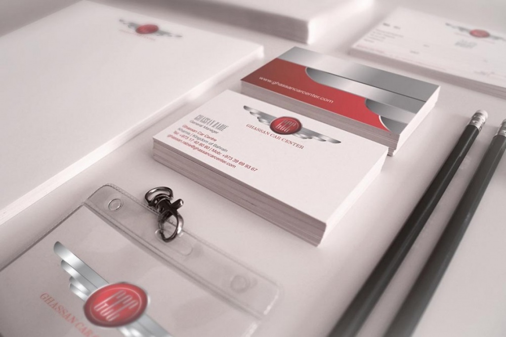
Having gained extensive knowledge from working at the National Motor Company the owner of Ghassan Car Center takes pride in offering the best car deals available with a high quality of service. We have been working together with Ghassan Car Centre from the outset creating all branding communications for them.
Bahrain Airport
Best service in the GCC
Doha Wireless Co.
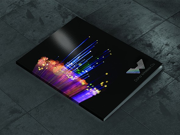
Top Logo – The concept behind this logo idea is based upon the microwave network infrastructure. It creates a feeling of the towers and the dishes used within a W shape. To enhance this further a W has been created within the network structure in Magenta. The magenta/maroon colour is linked to the Qatari flag colour, where the company is based. Furthermore this network system can be enhanced graphically by incorporating a star system background, linking to the fact that the network infrastructure emits out into the ether.
Middle Logo – The following logo idea derives from the waves created and how it connects everything together precisely still using the W shape. To enhance the effect of how these waves move it is possible to use holographic foils when printing to give a feeling of rainbow movement across the shape.
Bottom Logo – The idea behind this logo is to use more fluid shapes to create the W as wireless waves can vary going from point to point. Here it is simplified and very corporate.
IPS
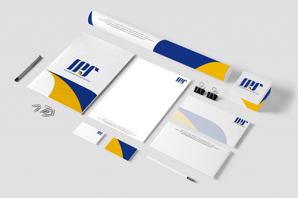
Left Logo – The concept behind this logo idea is based upon the VISA. It creates a feeling of trust and reliability. To enhance this further a the blue colore merge with the yellow that create leaf shape that represent nature. The Blue/Yellow colour is linked to the Visa colours, where it makes the company more familiar. Furthermore this logo can be enhanced graphically by incorporating a conaction system background, linking to the fact that tahe network infrastructure emits out into the ether.
Right Logo – The concept behind this logo idea is based upon the VISA. It creates a feeling of trust and reliability. To enhance this further a the blue colore merge with the Green that create leaf shape that represent nature. The Blue/Green colour is linked to the Visa colours, where it makes the company more familiar. Furthermore this logo can be enhanced graphically by incorporating a conaction system background, linking to the fact that tahe network infrastructure emits out into the ether.
Organika

Organika Foods is one of Bahrain’s leading foodservice distributors. They wanted us to create a new image for their store to increase sales and distribution (Re-branding). Firstly a new logo was created and then a whole new concept was implemented based on their philosophy of providing only organic and environmental friendly products. The colours and the concept are based on mother nature, using leaf, wood and granite stone.