Doha Wireless Co.

Doha Wireless Co.
Wireless system integrated solutions
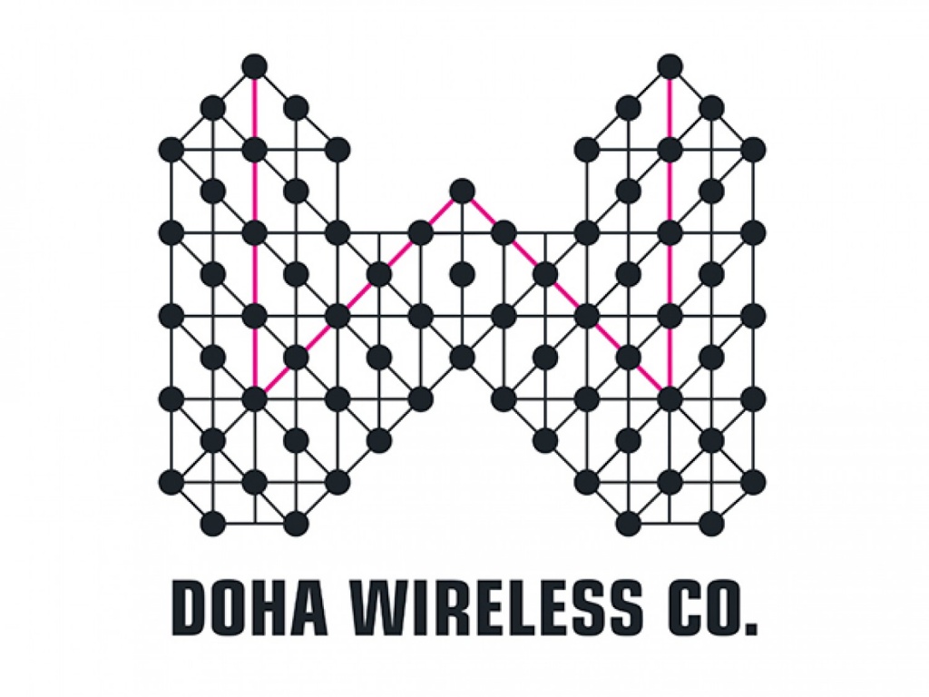
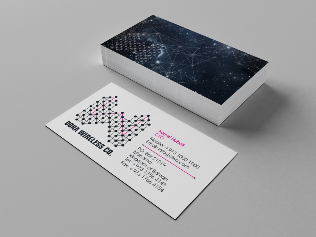
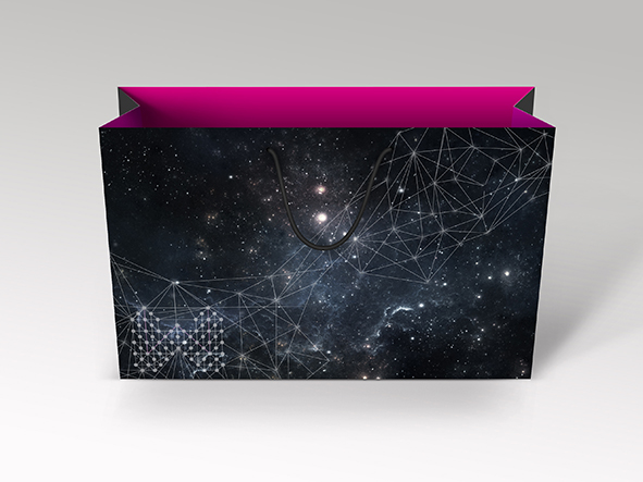
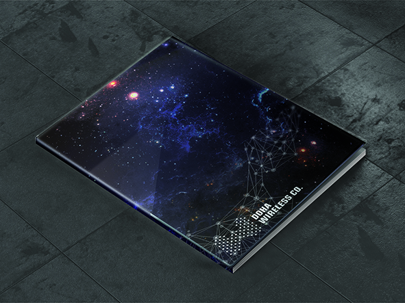
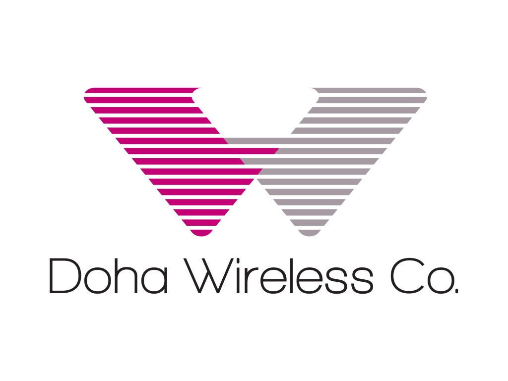
Top Logo – The concept behind this logo idea is based upon the microwave network infrastructure. It creates a feeling of the towers and the dishes used within a W shape. To enhance this further a W has been created within the network structure in Magenta. The magenta/maroon colour is linked to the Qatari flag colour, where the company is based. Furthermore this network system can be enhanced graphically by incorporating a star system background, linking to the fact that the network infrastructure emits out into the ether.
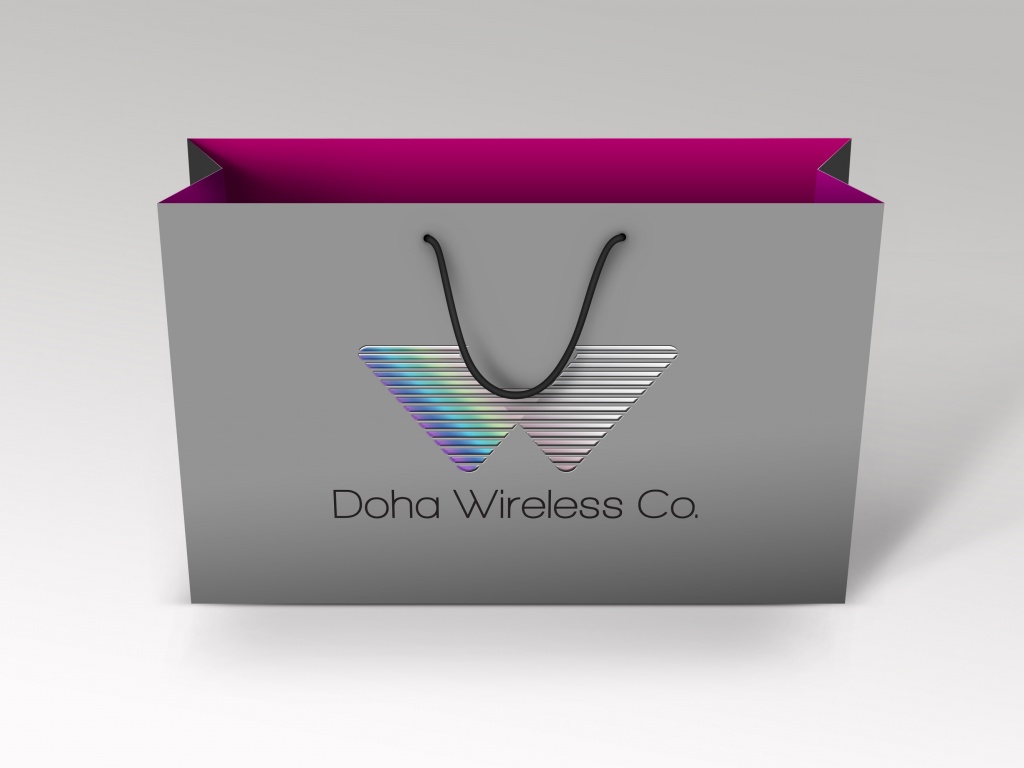
Middle Logo – The following logo idea derives from the waves created and how it connects everything together precisely still using the W shape. To enhance the effect of how these waves move it is possible to use holographic foils when printing to give a feeling of rainbow movement across the shape.
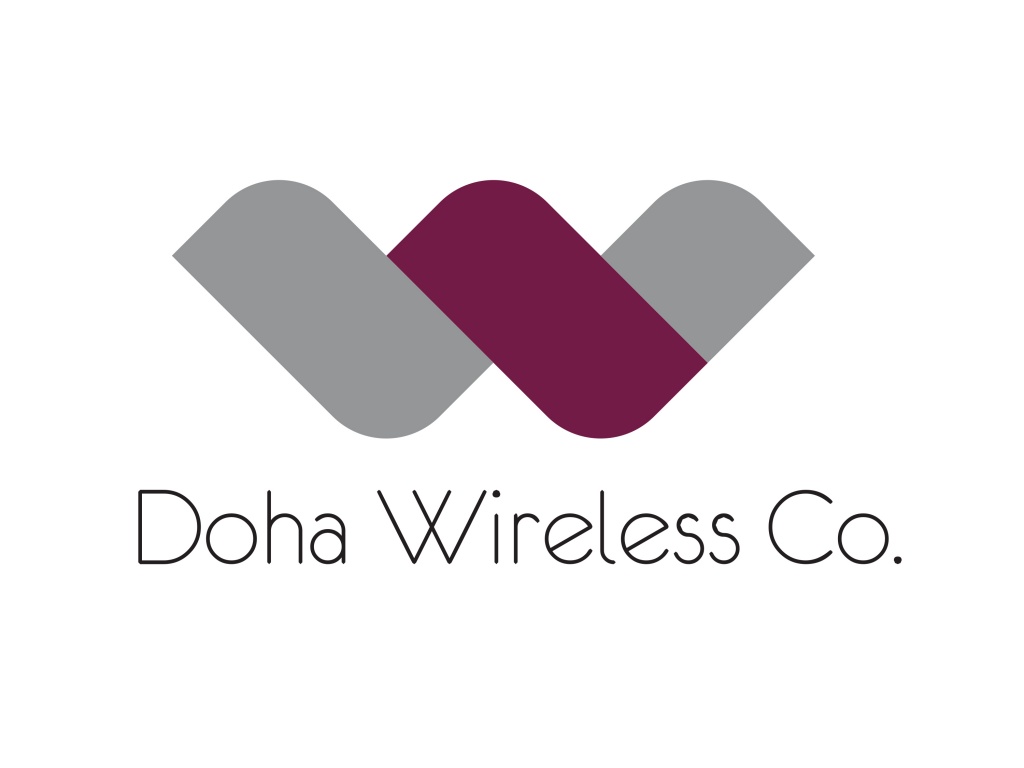
Bottom Logo – The idea behind this logo is to use more fluid shapes to create the W as wireless waves can vary going from point to point. Here it is simplified and very corporate.
Wireless system integrated solutions
Top Logo – The concept behind this logo idea is based upon the microwave network infrastructure. It creates a feeling of the towers and the dishes used within a W shape. To enhance this further a W has been created within the network structure in Magenta. The magenta/maroon colour is linked to the Qatari flag colour, where the company is based. Furthermore this network system can be enhanced graphically by incorporating a star system background, linking to the fact that the network infrastructure emits out into the ether.
Middle Logo – The following logo idea derives from the waves created and how it connects everything together precisely still using the W shape. To enhance the effect of how these waves move it is possible to use holographic foils when printing to give a feeling of rainbow movement across the shape.
Bottom Logo – The idea behind this logo is to use more fluid shapes to create the W as wireless waves can vary going from point to point. Here it is simplified and very corporate.
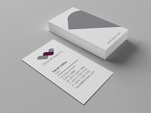
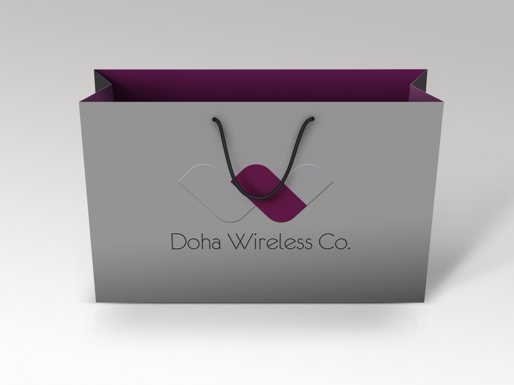
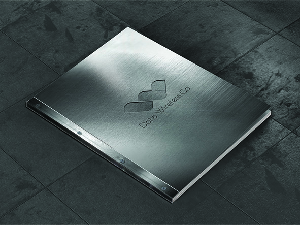
Gallery